Grab your art & Printables at discounted prices!
Color Psychology in Art: How Colors Affect Your Mood
A.k.a. Why That One Painting Makes You Weirdly Calm and Another One Makes You Want to Repaint Your Whole Life
ART & CREATIVITY
Ceren McKay
Ever stared at a painting and felt... something? Like a sudden burst of joy? Or maybe a mysterious calm washing over your very stressed-out soul? That’s not just your imagination, that’s color psychology doing its magic.
As an artist, I don’t just pick colors because they look pretty together (though that’s part of the fun). I choose them because they say something, sometimes louder than the boldest brushstroke. Color isn’t just a visual choice; it’s emotional. It’s a silent conversation between art and brain.
Let’s take a closer look at what your favorite hues might be whispering to you…
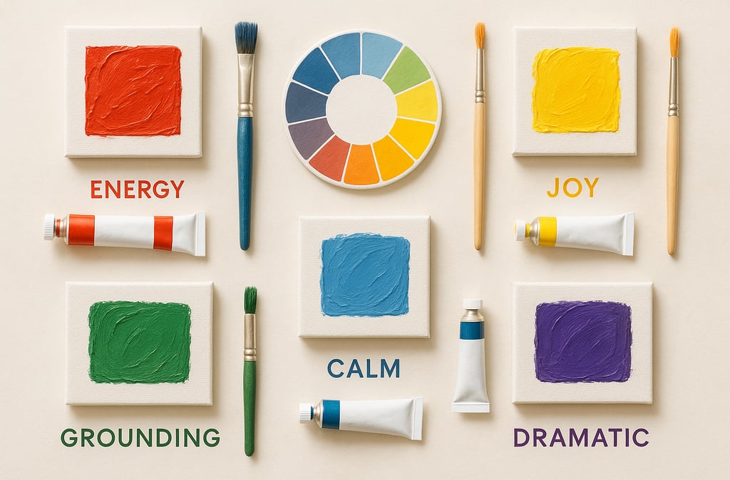
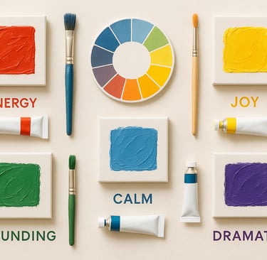
🌈 Red: The Drama Queen
Red is passion. Red is bold. Red will not be ignored.
Whether it’s the deep crimson of a stormy mood or the fiery pop of a confident flourish, red commands attention. It can raise your energy levels, make your heart beat faster, and even (scientifically speaking) increase appetite. So, if you’re hanging art in your kitchen or want a piece that makes a space feel alive, red’s your go-to.
Mood it evokes: Excitement, power, urgency, intensity
Perfect for: Statement pieces, dining rooms, waking up your senses
💛 Yellow: The Eternal Optimist
Yellow is that friend who shows up with coffee and sunshine.
It’s bright, cheerful, and unapologetically optimistic. But too much yellow? It can get a little… overstimulating. Like drinking five espressos. Used thoughtfully though, it adds joy and energy; like visual vitamin D.
Mood it evokes: Happiness, hope, energy, clarity
Perfect for: Offices, kitchens, or anywhere you need a mental pick-me-up
💙 Blue: The Inner Peace Guru
Blue is basically a chill playlist in color form.
It lowers blood pressure (seriously), calms the mind, and brings a sense of stability. That’s why so many of us are drawn to ocean or sky tones; they remind us to breathe. In art, blue helps create depth, serenity, and introspection.
Mood it evokes: Calm, trust, thoughtfulness, introspection
Perfect for: Bedrooms, meditation corners, your “I need quiet” nook
💚 Green: The Peaceful Plant Lover
Green is like a walk in the forest; in pigment form.
It’s all about renewal, balance, and restoration. In art, green can feel fresh and grounding; it also pairs well with both warm and cool tones, making it surprisingly versatile.
Mood it evokes: Balance, growth, harmony, restoration
Perfect for: Living rooms, workspaces, or anywhere you want to feel rooted
🖤 Black & White: The Minimalist Philosophers
These two don’t say much; but when they do, it’s profound.
Black adds drama, elegance, and mystery; white brings light, space, and purity. Together or alone, they’re powerful; especially when you want to highlight contrast or make other colors pop.
Mood they evoke: Clarity, contrast, contemplation, sophistication
Perfect for: Modern spaces, galleries, anywhere you want a bold statement without all the shouting
💜 Purple: The Daydreamer
Purple has big “I’m an old soul with a sparkly imagination” energy.
Historically the color of royalty and creativity, it brings a sense of luxury and introspection. Deep purples feel moody and mysterious; lavender brings calm and whimsy. In art, it can add a sense of depth, magic, or drama; sometimes all at once.
Mood it evokes: Creativity, spirituality, luxury, introspection
Perfect for: Reading nooks, studios, bedrooms; anywhere that needs a touch of dreaminess
🧡 Orange: The Extrovert
Orange walks into a room and immediately says, “Let’s make something!”
It’s playful, warm, and often underestimated. Orange is a motivator; it encourages creativity, connection, and fun. Use it to spark conversations or bring cozy energy to a space.
Mood it evokes: Warmth, playfulness, enthusiasm
Perfect for: Creative spaces, social areas, or rooms that need a spark
How This All Ties Into My Art
When I create, I think a lot about how I want someone to feel when they look at a piece.
Do I want you to feel energized? Anchored? Peaceful? Curious? The colors I choose are part of that invitation. Whether it’s a punch of bright yellow to wake up your walls or a sea of cool blue to soothe your nerves after a long day, every choice is intentional.
That’s why picking art for your space isn’t just about matching your couch; it’s about matching your mood and energy. Think of it like emotional décor. You’re not just hanging a picture — you’re inviting in a feeling.
🎁 Want to Try It Yourself?
Browse my Art Prints to see how color comes to life in bold, printable form.
From calming pieces in earthy tones to bold abstracts in punchy reds and yellows, there’s something for every vibe.
☕ Final Thoughts
Color is powerful. It speaks before we even realize we’re listening. And in art, it’s one of the best ways to shape your space, shift your mood, or simply feel something.
So next time you find yourself drawn to a color… lean into it. There might be a reason your walls are begging for a pop of teal or a splash of crimson.
And hey, if you’re still unsure which mood your walls are in the mood for, I’ve got you. My abstract art doesn’t whisper... it sings. Loud, proud, and full of feeling.
A. Ceren McKay
Visit, Follow & Subscribe on Social Media
🎨 Snag exclusive discounts, early access to new drops. No spam—pinky promise!
A. Ceren McKay © 2025. All rights reserved.
Designed by A. Ceren McKay